Rack
One <main> to rule them all.
Troy is the founder and CEO of Gearbox. He likes cars. A lot.
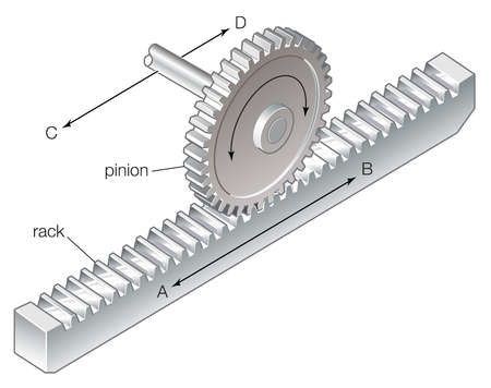
A “Rack and Pinion” is a system of gears, most commonly found in steering systems of cars. The pinion is a circular gear that fits into and runs along a slotted track (rack). It looks a little something like this:

This serves as a model for how we structure our pages:
We have a
Rackcomponent, which acts as a giant container.We have our
Pinioncomponent, which wraps individual components and controls their position within the Rack.We put these pinion wrapped components into the Rack and put the Rack on a page.
Like the circular gears on the track, the components work together. This means have finer control over things like site-wide spacing and responsive design, while crafting an efficient build process at the same time.
Because Rack houses all the components on a given page, it follows that it is a styled main element.
There are two steps that are required for Rack to know what components fit inside of it:
Obtain an array of components as data from our CMS (Sanity, in this case).
Check to see that the given component matches with an entry in the
Rack Component List.
When we use the page builder approach in Sanity, our CMS, we give the client the option to select what components they want from a dropdown list.
This list then gets sent along as an array of components that Rack consumes.
Each component has a _type field that contains the name of the component in camel case.
The second key to making this work is the Rack Component List. Every component we use on a given wesbite will be included in this list,
and it's important to remember to add them as you go.
We leverage Next's dynamic import statements to ensure that we only load the components the given page needs:
import dynamic from 'next/dynamic';

const RackComponentList = {
  accordion: dynamic(() => import('@components/Accordion')),
  border: dynamic(() => import('@components/Border')),
  cards: dynamic(() => import('@components/Cards')),
  cardsBlock: dynamic(() => import('@components/Cards/CardsBlock')),
  embed: dynamic(() => import('@components/Embed')),
  formComponent: dynamic(() => import('@components/Form')),
  gallery: dynamic(() => import('@components/Gallery')),
  heading: dynamic(() => import('@components/Heading')),
  imageSlider: dynamic(() => import('@components/ImageSlider')),
  link: dynamic(() => import('@components/Link')),
  media: dynamic(() => import('@components/Media')),
  mediaWithText: dynamic(() => import('@components/MediaWithText')),
  logoGrid: dynamic(() => import('@components/LogoGrid')),
  pageAnchor: dynamic(() => import('@components/PageAnchor')),
  quote: dynamic(() => import('@components/PullQuote')),
  slider: dynamic(() => import('@components/Slider')),
  spacer: dynamic(() => import('@components/Spacer')),
  team: dynamic(() => import('@components/Cards/CardsTeam')),
  textBlock: dynamic(() => import('@components/Text/TextBlock')),
  textColumns: dynamic(() => import('@components/TextColumns')),
  tableBlock: dynamic(() => import('@components/Table')),
  video: dynamic(() => import('@components/Video/VideoEmbed')),
};

export default RackComponentList;
Back in Rack, if the _type matches a the name of a component in this list, we wrap it in a Pinion and throw it on the page.
There are a few exceptions - we avoid wrapping our Spacer or Anchor components by default, but depending on
the project, there may be more that you will want to add to that list.
This method makes it easy for clients who wish to have full control over what components they include on their pages. This won't always be the client preference. We've built many projects that have pre-built pages with components they cannot change.
In this instance, we create our own rack by manually wrapping each component in a Pinion in the page's layout file.
To learn more about the Pinion component, you can access the documentation here.